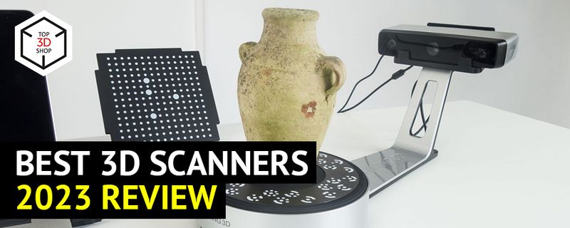
Best 3D Scanners in 2023
3D scanning is the process of creating a three-dimensional model of a real-world object through collecting the information on its physical shape. The technology appeared in the 1960s; the first 3D scanners used lights, cameras, and projectors, and the scanning process was far from perfect as it took plenty of time to get more or less accurate results. Later on, in the end of 1980s, 3D scanners became more advanced with the use of lasers and white light, the accuracy improved greatly as well as scanning speed, and the variety of possible applications started to expand rapidly.
Credit: YouTube / Vision Miner
This is Top 3D Shop, and in this article, we are going to tell you about different 3D scanning technologies used today and their applications. We will also discuss how to choose a 3D scanner and provide you with some of the top-notch models from different categories, so as not to get disappointed with the result and make the best of all capabilities. Read on to learn more.
How does 3D scanning work?
Credit: weareprintlab.com
Generally, the final goal of the scanning process is to get a digital three-dimensional representation of a physical object or environment. Some 3D scanners are also capable of capturing the color (which in 3D scanning is usually referred to as texture capturing). There are various technologies used by different scanner types, and the working principle depends on the particular technology. Basically, there are two main types of 3D scanning that work either on contact or non-contact principle. Each type has different variations with their own advantages and disadvantages and best suitable application fields. Below is the overview of the most common 3D scanning technologies.
3D scanning technologies
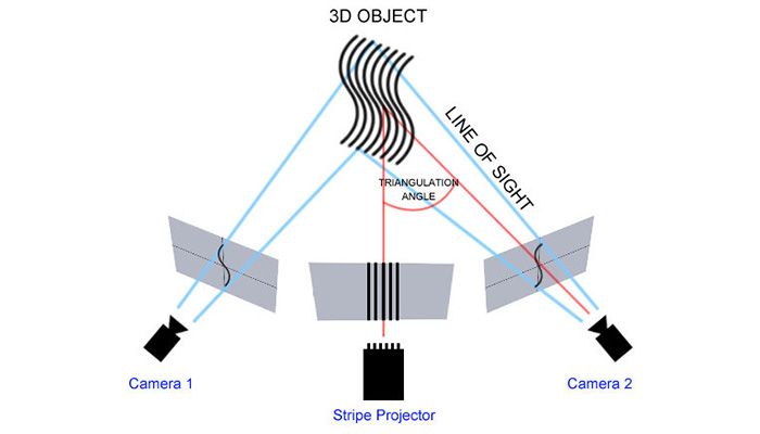
Laser triangulation
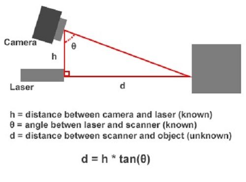
Laser triangulation scanners are equipped with a laser emitter and a camera. A laser point or a laser stripe emitted by the scanner bounces off the surface being scanned and is picked up by the camera. Having calculated the reflection angle of the laser beam, the scanner measures the distance to the object. The scanner makes millions of such measurements over the entire object surface, creating a point cloud which can be used directly for measurements or transformed into a polygonal, surface, or parametric CAD 3D model.
3D scanners based on laser triangulation technology are highly accurate, yet versatile as they allow for ultra-fast scans with low resolution in case the speed is more important than quality.
On the downside is the scanning distance limited by a few meters. Such devices can not be used for scanning people or animals.
Credit: bitfab.io
Structured light
Structured light technology is also based on trigonometrical triangulation but instead of a laser point or stripe, these scanners project a structured light pattern, for example a line grid, onto the object. The pattern is distorted according to the object’s geometry, and the distance to the different points of the surface is measured.
Structured light scanners allow for extremely precise accurate scans at a high speed. Besides, they are safe to scan people and animals.
The scanning range does not usually exceed a few meters, these devices can not work properly in bright light conditions and usually have difficulties scanning shiny, black, or transparent surfaces, but all these challenges can be successfully overcome with the right equipment.
Credit: bitfab.io
Photogrammetry
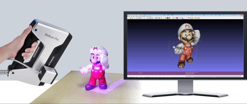
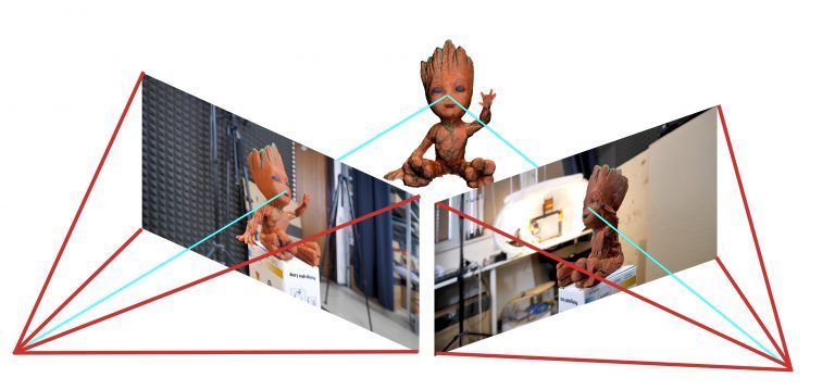
Photogrammetry, also called 3D scan from photographs, is a passive type of non-contact 3D scanning. It is based on taking a number of photographs of the object to scan from different viewpoints. The special software finds key points of the object that are present in all the photos, calculates the distance between them, and then a 3D model of the object is created.
The advantage of photogrammetry is that it does not require expensive equipment as the photographs can be taken with a digital camera or even a mobile phone. On the other hand, it needs special software and powerful hardware, and also requires certain skills. The technology is great for scanning large objects from long distances, such as buildings or landscapes. The precision of the scanning result usually depends on the photos resolution and on your computer capacity, and can be fairly high. Using photogrammetry you are able to capture not only the shape, but also the texture of the object.
Some high-end 3D scanners come with the photogrammetry feature to make best of its capabilities.
Credit: bitfab.io
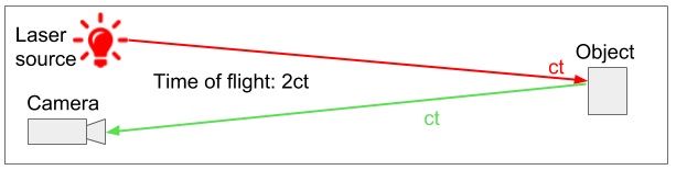
LIDAR (time-of-flight)
Laser pulse-based scanners use LIDAR (light detection and ranging) method to calculate the distance to the object. The technology is also known as time-of-flight as it measures the time it takes the laser beam to reach the surface of the object and come back. As the speed of light is well-known, it is easy to calculate the distance to the point on the surface of the object scanned. To achieve an accurate measuring result the scanner emits millions of pulses of the laser beam. Such 3D scanners are usually equipped with a mirror that changes the direction of the laser ray to get a full 3D scan.
The technology is capable of scanning huge objects and can work even in low light conditions. Although it can be a bit slow.
Credit: bitfab.io
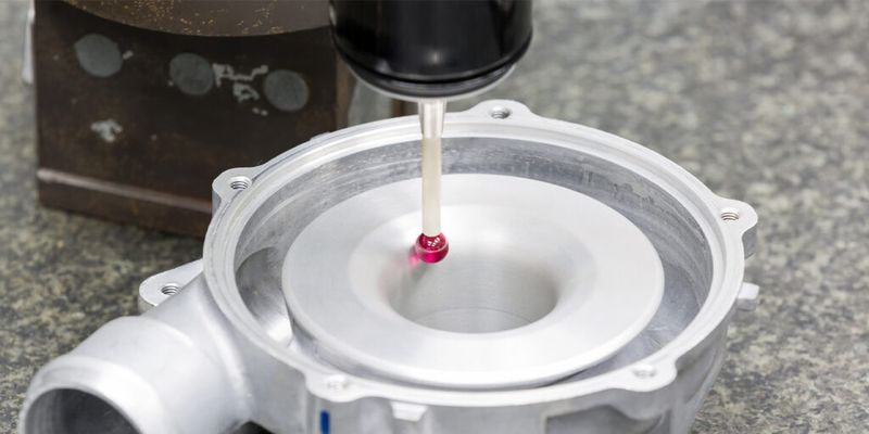
Contact-based
Contact-based 3D-scanning technology uses a touching probe to get the information about the object shape. There are two main types of contact-based scanning devices which are coordinate measuring machines (CMM) and articulated arms. The probe moves along the surface of the object which stays still.
High precision of this method as well as its capability to scan any surfaces including transparent and reflective ones allow using contact 3D scanning for inspection, although the speed is usually rather slow.
Credit: winnmachine.com
Buyer’s guide: things to consider when buying a 3D scanner
When choosing a 3D scanner that perfectly suits your needs, it is important to realize how different criteria influence the final results and which of them are of greater importance to your project. We have made up a checklist for you to help with the choice.
Budget
When planning on purchasing a 3D scanner, price can become a determining factor. The cost of the model usually depends on its capabilities, so you can save, for example, if you are buying a scanner for home use and do not need utmost accuracy or lightning-fast scanning speed. For professional applications the quality and speed are much more important and it is no good to compromise on them as it may cost you even more in the long term. Besides that, do not forget that cheaper devices may not include such things as warranty, technical support, free software, and others, and the overall quality of such scanners is unpredictable. That said, even a budget 3D scanner may become an excellent tool for particular needs — depending on the model chosen.
Speed
The scan speed parameter defines how fast a 3D scanner can take a scan. The measurement refers only to scanning itself, and the processing time is not usually taken into account. Scan speed can be measured in different ways depending on the scanner type and the manufacturer. Professional 3D scanners using structured light technology usually feature very high scan speed. For instance, the Shining 3D Einscan Pro HD can capture objects at a speed of up to 3,000,000 points per second with the frame rate of 10 FPS (frames per second).

Credit: YouTube / GreenScreenAnimals
The speed parameter can be of crucial importance when scanning moving objects, like people or moving machine parts. It can also play an important role if your project needs a lot of scanning and you are pressed for time. In other cases you can find the balance between speed and price.
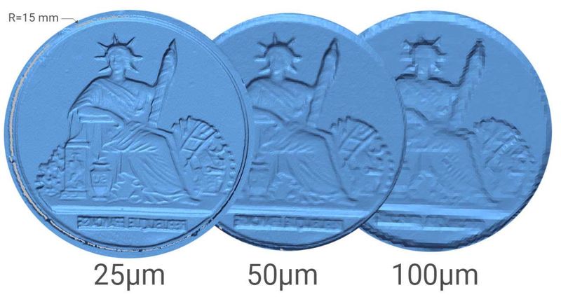
Resolution
In 3D scanning the resolution shows how detailed your 3D model will be. It is described as the least possible distance between two points in a 3D model (point-to-point distance) and is usually expressed in millimeters. The less the point-to-point distance, the higher the resolution and, consequently, the more details you can get. It can be paramount for such applications as 3D inspection, reverse engineering, jewelry, art, and others requiring an extremely detailed 3D model of an object.
Do not forget that the downside of high resolution is longer processing time and the need for powerful hardware.
Credit: sariki.es
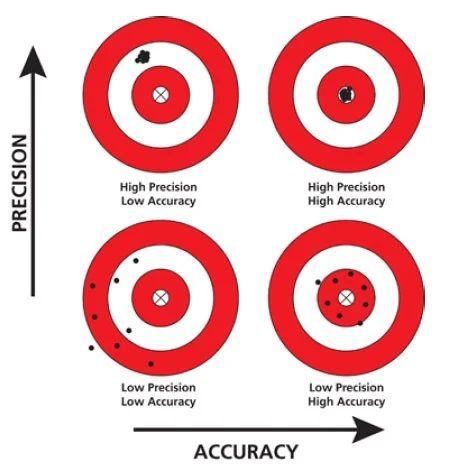
Accuracy and precision
The accuracy shows the difference between the measurements of the real object and those of the 3D model obtained from scanning. For portable 3D scanners this parameter normally ranges from 0.01 to 0.1 mm. High accuracy means a lot for industrial applications, namely quality inspection, and also for the fields of dentistry or patient-specific prosthetics.
Closely connected to the accuracy is the scanning precision which can be described as repeatability of the scanning result. If the accuracy shows how close the 3D model is to the real object, the precision shows how close several scans of the same object are to each other. Both parameters are very important as they allow for accurate, consistent and predictable results.
Credit: theanaestheticroom.com
Software and connectivity
In 3D scanning software plays a key role as it processes the scan data and offers various editing toolsets including specialized tools for particular applications, such as reverse engineering, generative design, and more. Professional devices usually come with dedicated software providing full compatibility with the scanner and ensuring optimal scanning results.
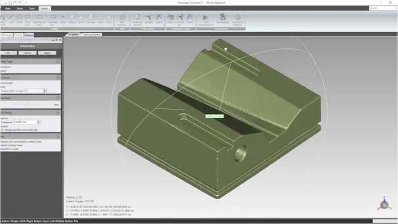
There are also a number of software solutions from third-party developers, like Geomagic Essentials, which is compatible with most 3D scanners and supports a lot of file formats.
Best budget 3D scanners 2023
Let’s begin our pick of the best 3D scanning equipment with a few affordable models that offer great price-quality ratio.
For the reader’s convenience, we will also specify recommended object sizes before proceeding to the description of the scanners, so you can quickly understand if the models meet your needs.
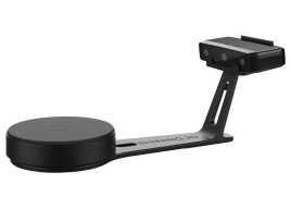
The recommended object sizes for our first two scanners are about between 3 and 30 cm (Einscan-SE) and 3–120 cm (Einscan-SP).
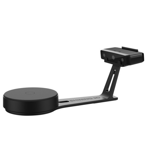
Shining 3D Einscan-SE V2
Starting with budget-friendly options, let’s take a look at the Einscan-SE V2. It is a desktop 3D scanner from Shining 3D based on the structured light technology and equipped with a white light source and two monochrome cameras. Featuring fast, high-precision color scanning in combination with reasonable price and ease of use, this model is a good choice for beginners, hobbyists, and small businesses.
The Einscan-SE offers two scanning modes, Auto Scan and Fixed Scan, with or without the turntable module included in the package. It is capable of performing a single scan in 10 seconds and a complete 360° scan from 1.25 to 2 min, depending on the step size selected and the HDR settings used, with a decent accuracy of 0.1 mm and scan volume of 700 х 700 х 700 mm. The device comes with professional scanning software that can smoothly align scans with the help of multiple user-friendly functions, like auto filling, smoothening, sharpening, etc.
Being a stationary solution, the Einscan-SE is not ideal for scanning large or complex objects, but its speed, accuracy, simple setup with automated calibration and one-click operation make it great for a variety of applications, such as architecture, generative design, reverse engineering, modeling, science, healthcare, and more.
Marseille Sculpture by SHINING 3D on Sketchfab
- high resolution and accuracy of resulting scans
- two modes of scanning: fixed and auto
- color scanning and HDR support
- straightforward calibration process
- high scanning speed
- thoughtful supply package
- nearly impossible to scan in brightly lit areas or outside without covering the scanner head
- to scan dark and shiny areas one would need to use scanning spray, unlike with laser 3D scanners
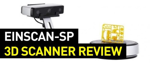
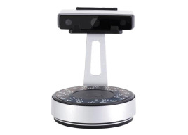
Shining 3D Einscan-SP V2
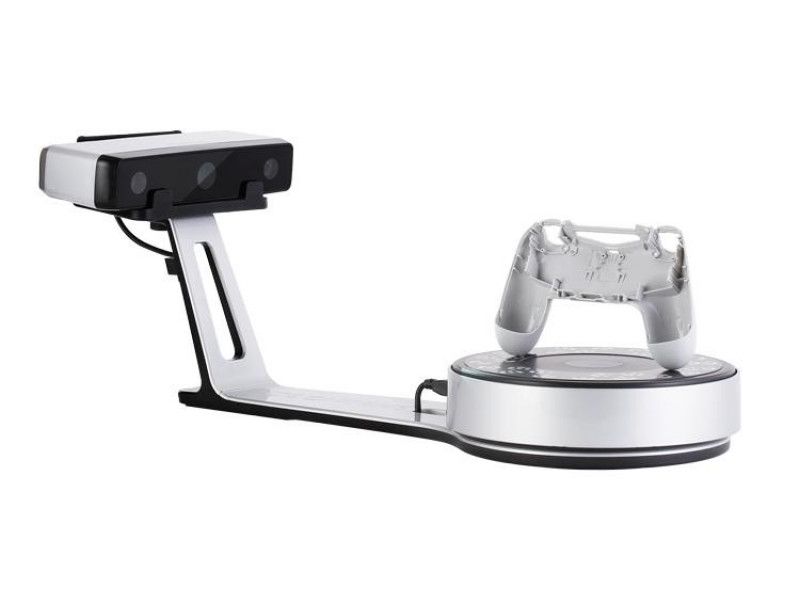
The Einscan-SP is the Platinum counterpart of the previous model. This high-performance desktop 3D scanner is also based on the structured light technology and features two operation modes, Auto and Fixed, auto-calibration, convenient turntable module, color and texture scanning capabilities, and professional software with intuitive interface and handy tools, including multiple ways of alignment.
Compared to the Einscan-SE, the device offers enhanced single shot accuracy of below 0.05 mm, faster scan speed with a single scan in 4 seconds and a 360° auto scan in just 1 minute, and enlarged capture area of up to 1200 х 1200 х 1200 mm. Its compact footprint and stylish design make the Einscan-SP a perfect fit for any type of desk. Besides, due to the auto-meshing to watertight models, it is compatible with a variety of 3D printers providing high-quality, directly printable 3D data.
With impressive accuracy and versatile functionality, this affordable high-resolution device can efficiently capture the geometry of complex objects with fine detail producing top-quality 3D data for manufacturing, reverse engineering, modeling, heritage preservation, artifact restoration, art, generative design, and much more.
Wood Buddha by SHINING 3D on Sketchfab
- high scanning speed without loss of accuracy and detail
- semi-automatic calibration
- color and texture scanning
- compatible with most 3D printers
- multifunctional, easy to use
- the scan volume in auto mode is fairly restricted
- to scan dark and shiny areas, one would need to use scanning spray
For the next model in the segment, the recommended object size is between 30 and 300 cm.
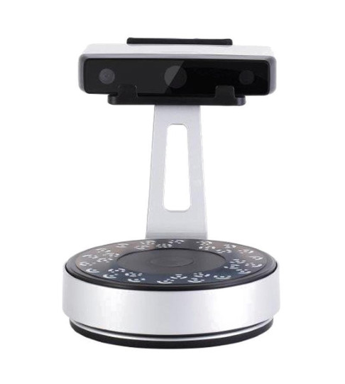
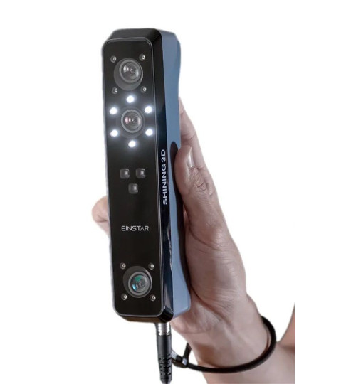
Shining 3D Einstar
The Einstar manufactured by Shining 3D is a portable handheld 3D scanner designed for versatility and simplicity of use. Alongside high resolution and fast acquisition speed, one of the biggest advantages of the model is its lightweight (only 500 g) compact design with intuitive controls making for flexible working distance and convenient operation.
Equipped with a built-in RGB camera, it offers full-color scanning for more detailed models. The device uses white structured light in combination with the infrared VCSEL technology, which is great for safe and comfortable face scanning. Featuring object and portrait modes, the Einstar also provides a special hair mode for better hair capturing. In addition, three IR VCSEL projectors together with two stereo depth cameras ensure flawless outdoor performance even in bright light.
Thanks to its portability, the device is an ideal option for those needing a mobile scanning solution with ample capabilities. Due to its hybrid light source and variable object size, the Einstar can be used for a wide range of consumer and professional applications, including 3D printing, design, digital archiving, education, art, VR and AR, and others.
Vase by SHINING 3D on Sketchfab
- professional-grade quality scans
- incredible performance under different lighting conditions
- completely safe for face scanning
- compact and convenient handheld design
- comprehensive software for the entire 3D scanning process
- excellent performance-to-price ratio
- may struggle with darker or shiny objects
- software is not compatible with macOS or Linux
Best handheld professional 3D scanners 2023
When it comes to professional 3D scanners, accuracy, capturing speed, and convenience of use matter the most. As for scan volume, we have selected several categories of devices, with the first one featuring the recommended object size between 2 and 30 cm.
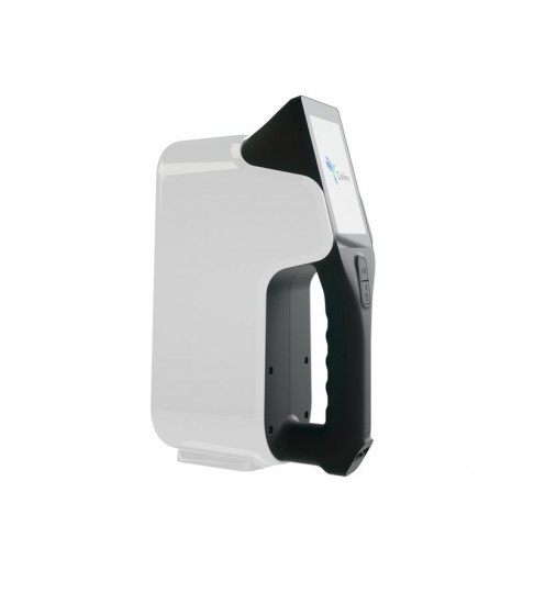
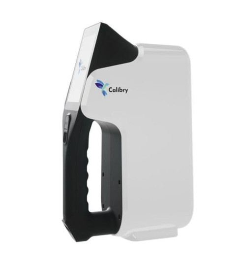
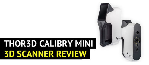
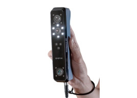
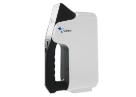
Thor3D Calibry Mini
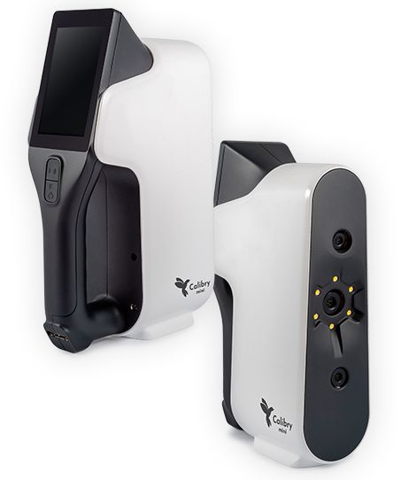
The Thor3D Calibry Mini is a professional yet easy-to-use handheld 3D scanner designed for capturing small intricate objects from 2 to 30 cm in length. To meet strict quality requirements, it offers high resolution, lightning-fast scan speed, ergonomic design, and a handful of other useful features for various advanced applications.
Based on the structured light technology, this modular device offers three versatile scan modes — texture, geometry, and markers. With the accuracy of 0.07 mm at 30 fps, outstanding scanning speed of 1M points/s, and quality color and texture acquisition, it can successfully work with hair, dark, shiny, or casting metal surfaces with sharp edges. Furthermore, the Calibry Mini is aimed at a friendly and streamlined user experience with its smart design and all-in-one software solution.
Being a lightweight scanner that can easily be taken anywhere, the Calibry Mini is perfect for medical, educational, archeological, and cultural heritage preservation fields, as well as for AR/VR archiving, rapid manufacturing, and prototyping.
- highest resolution of all the scanners presented in the article
- full-color scanning
- three tracking modes
- excellent scanning of black and shiny objects
- lightweight and portable design
- might require additional software for post-processing
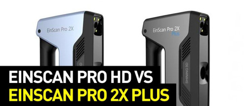
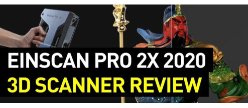
Einscan Pro 2X 2020
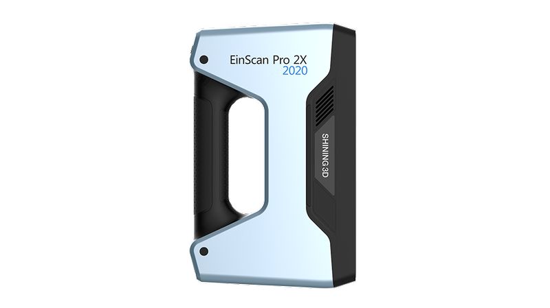
The Einscan Pro 2X 2020 is a high-precision handheld 3D scanner based on structured light technology. Although it also focused on scanning small objects between 2 and 100 cm, its resolution is slightly lower than that of the Thor3D Calibry Mini — 0.2 mm vs. 0.15 mm respectively.Offering a decent scanning area and high data acquisition speed of up to 3,000,000 points/s, it is aimed at flexibility, portability, expandability, and ease of use.
The scanner operates in four different modes and can be upgraded with two additional modules to meet an even wider range of 3D scanning challenges. Its enhanced accuracy of up to 0.04 mm is perfect for dealing with complex objects of various sizes. With several alignment algorithms and a minimum point distance of 0.2 mm, the Einscan Pro 2X 2020 is able to create astonishingly accurate renders that reflect all the intricacies of an original.
Representing a highly efficient and versatile solution, the scanner is extremely easy to use and comes ready to scan right out of the box. Due to a convenient and lightweight design, it boasts extreme transportability and provides plug-and-play installation for unlimited scanning experience in a plethora of different applications.
Sea Snail by SHINING 3D on Sketchfab
- flexible operation methods
- impressive scanning speed
- great single scan accuracy
- large scan volume
- portability and simplicity of use
- color scanning is available only with an optional module
![Einscan Pro 2X 2020 / V2 3D Scanner [1 x Aesub Spray for Free]](https://top3dshop.com/image/cache/catalog/products/3d_scanners/shining_3d/einscan_pro_2x/einscan_pro_2x_4734d382-486x540.jpg)
For the next category, the recommended object size is from 3 (30 for the Einscan HX) to 300 cm.
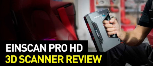
Einscan Pro HD
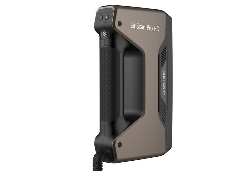
The Einscan Pro HD is a handheld structured light 3D scanner that offers high-definition scans with exceptional detail and accuracy up to 0.045 mm. As the most versatile 3D scanner in the category, the Pro HD can successfully scan both small and large objects without a problem. Combined with a fast acquisition speed and outstanding scan range of 310 x 240 mm, the device becomes a great tool for demanding professional applications, from reverse engineering to healthcare.
It comes with four versatile scanning modes differing in terms of object size, complexity, and use of a turntable as well as resulting precision and speed levels. Each mode is optimized for various uses delivering fast industry-grade results. Furthermore, the Einscan Pro HD shows high efficiency at capturing complex, dark, and casting metal surfaces due to reliable algorithms and an improved projector.
Apart from the standard package, there are optional color (additional HD camera) and industrial (automatic turntable and tripod) add-ons available to extend the range of applications of this multi-functional machine with full-color texture capture and rapidly-paced scanning support.
Face by SHINING 3D on Sketchfab
- exceptional accuracy
- lightning-fast scanning speed
- lightweight ergonomic design
- advanced upgradeability
- easy setup and use
- requires a steep learning curve to fully utilize its features
![Einscan Pro HD 3D Scanner [1 x Aesub Spray for Free]](https://top3dshop.com/image/cache/catalog/products/3d_scanners/shining_3d/einscan_pro_hd/shining_einscan_pro_hd_3d_scanner_3-486x540.jpg)
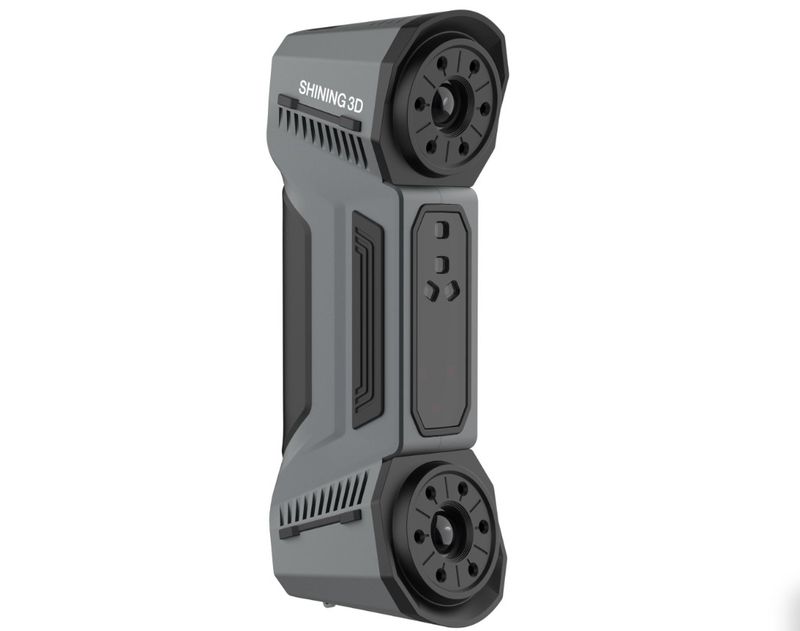
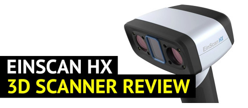
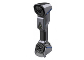
Einscan HX
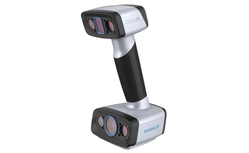
The Einscan HX is a versatile handheld 3D scanner that effectively blends blue laser and structured light technologies. As a premium device, it offers astonishing accuracy of up to 0.04 mm, high resolution of 0.05 mm, rapid scanning with the speed reaching 1,200,000 points/s, advanced software, and many other useful features for truly professional experience in reverse engineering and beyond.
With its innovative hybrid system, the Einscan HX is capable of entering the rapid or the laser scanning mode designed to capture dark-colored models and objects with reflective surfaces. Thanks to the built-in color camera, the device supports full-color capture and allows for texture tracking. Best of all is its easy setup: just connect the scanner to your computer with the dedicated USB cable and follow the manual.
For such a powerful device, the Einscan HX boasts a lightweight, ergonomic, and futuristic design allowing one to take it to remote sites for top-quality scanning. It is almost indispensable for modern needs of such spheres as architecture, industrial engineering, heritage preservation and restoration, healthcare, science, and more.
Compressor by SHINING 3D on Sketchfab
- the most affordable laser 3D scanner currently available on the market
- impressive level of accuracy
- fast operation speed
- decent scan volume
- compact and convenient design
- integrated color camera
- requires some learning to get the hang of the scanning process
![Einscan HX 3D Scanner [1 x Aesub Spray for Free]](https://top3dshop.com/image/cache/catalog/products/3d_scanners/shining_3d/einscan_hx/einscan_hx_image6-486x540.jpg)
Finally, let’s look at the scanners with the recommended object size of up to 1000 cm.
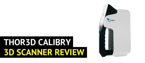
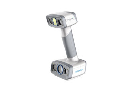
Thor3D Calibry
The Calibry from Thor3D is a compact handheld 3D scanner for fast, precise, convenient, and affordable scanning. Its main feature is an extremely wide capture range allowing the user to digitize products from 20 cm to 10 m in length without loss of accuracy of up to 0.1 mm.
In terms of operation, the Calibry adopts structured white-light technology for eye-safe use and accurate results. It also employs patented texture cameras for high-quality color capturing. With three flexible tracking modes, namely geometry, texture, and markers, it copes well with various difficult-to-scan items, such as hair, sharp edges, dark and glossy products. A built-in touchscreen with a real-time preview makes for seamless 3D scanning and post-processing experience.
Since the scanner comes pre-calibrated, it is ready for work right out of the box. Thanks to its large scan volume, high speed, accuracy, and level of detail, the Calibry can be successfully used by engineers, doctors, designers, universities, artists, etc.
Samui Lady by Thor3D on p3d.in
- large-scale 3D scanning capabilities
- fast data acquisition with accurate results
- capable of capturing complex surfaces (dark, shiny, reflective)
- easy to navigate 4" touchscreen
- compact and lightweight design
- Calibry Nest software is not easy to navigate
- not suitable for scanning small objects
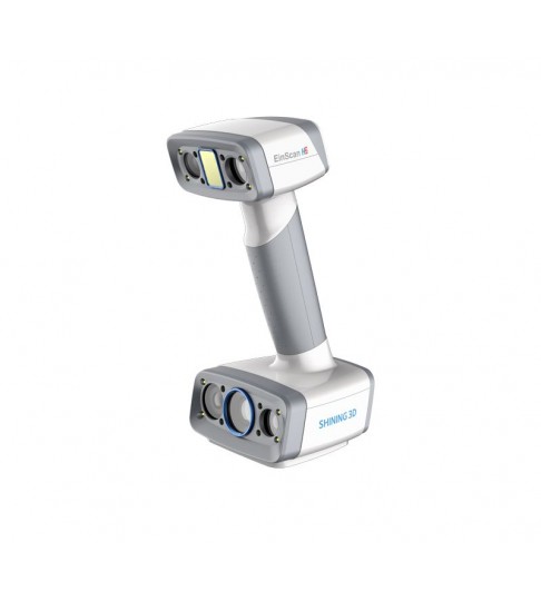
Einscan H2
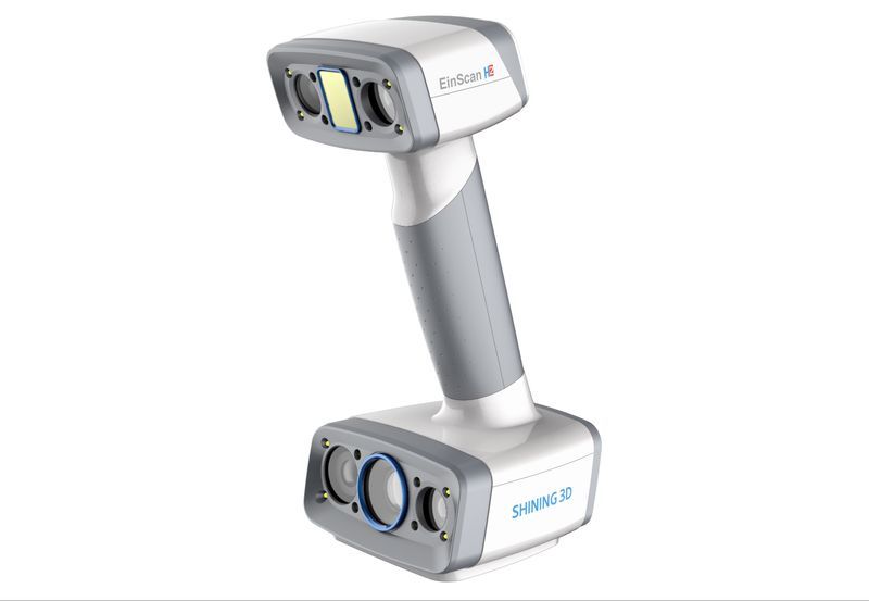
The Einscan H2 is a comprehensive hybrid LED and infrared handheld 3D scanner aimed at both hobbyists and experienced users. It offers high accuracy of up to 0.05 mm, extreme ease of use, brand portability, and adaptability at a reasonable price.
Being an upgraded version of the original EinScan H 3D scanner, the H2 model is engineered with a 5MP resolution texture camera, smart precision algorithms, and 3 infrared VCSEL projectors for more photorealistic textures and better scan quality. With its wide scanning area and flexible working distance, the device is great for various scenes and objects of different sizes, colors, and textures. In IR mode, it is able to efficiently capture dark and reflective objects as well as the human body, face, and hair.
Due to its outstanding price-performance ratio, powerful software, portable design with the weight of only 731 grams, and intuitive button layout, the Einscan H2 ensures comfortable device management with maximum efficiency.
Dragon by SHINING 3D on Sketchfab
- high-resolution texture camera
- enhanced precision algorithms
- impressive scan accuracy and FOV
- great environmental adaptability
- user-friendly ergonomic design
- professional scanning software
- not suitable for scanning small objects
Best industrial 3D scanners 2023
Now, let’s get to the purely industrial solutions fit for the most precise tasks. For the first model (FreeScan UE Pro), the recommended object size is between 3 cm and 10 m, while for the second (FreeScan Combo) it is 3–600 cm.
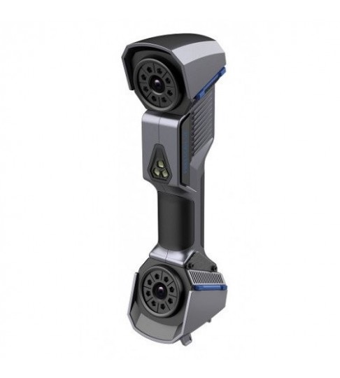
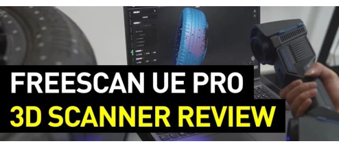
Shining 3D FreeScan UE Pro
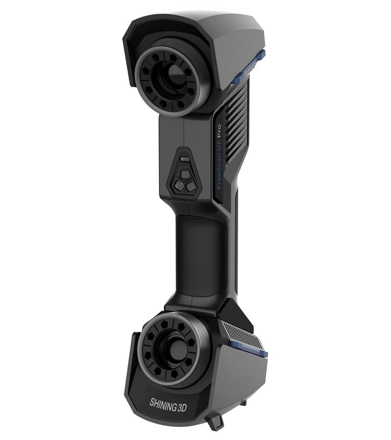
The Shining 3D FreeScan UE Pro is a laser handheld professional 3D scanner offering high accuracy, stability, and ergonomic design. Featuring advanced metrology and deep learning algorithms for optimal performance, it is capable of delivering precise scans even in challenging industrial environments.
Equipped with an eye-safe laser technology composed of 26+5+1 blue laser lines operating in three different modes, the scanner boasts impressive versatility alongside time-effective scanning speed of 1,850,000 points/s. With an integrated photogrammetric module, it provides increased volumetric accuracy perfect for objects with complex geometry. Moreover, the Freescan UE Pro is capable of effective scanning of dark and reflective surfaces.
The device offers a clear interface and supports the most relevant inspection and design software. Due to its high level of detail, global precision control, and durable construction, the FreeScan UE Pro is ideal for industrial applications where accuracy and robustness are crucial. It is particularly great for automotive design, fluid dynamics analysis, virtual assembly, quality control, workpiece repair and maintenance, and more.
Engine Cylinder by PRECISE3DM on Sketchfab
- scan size up to 10m with the use of built-in photogrammetry
- impressive accuracy of 20 microns and volumetric accuracy of 0.02 mm + 0.03 mm/m
- ability to scan fairly large parts at a consistent speed
- multiple modes for specific purposes
- 2 times more affordable than the market alternatives
- orientational videos from the manufacturer
- requires the use of markers on all the scans
- laser 3D scanners do not support geometry or texture tracking, nor do they support color
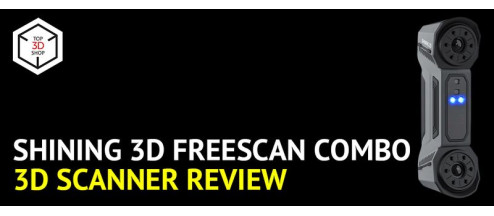
Shining 3D FreeScan Combo
The FreeScan Combo is a flexible metrology-grade 3D scanner offering all the benefits of the hybrid light source. Combining blue laser and infrared VCSEL technologies, the device ensures high accuracy up to 0.02 mm, fast speed of data acquisition, wide scanning range, and versatility making it great for a number of industrial applications.
The scanner provides a maximum scan speed of 1,860,000 points/s in the laser mode and up to 2,250,000 points/s while using the IR light source. Overall, the FreeScan Combo features four modes for scanning large objects and precise capturing of fine details and deep holes. Moreover, the VCSEL technology allows for quality body digitizing and marker-free scanning of objects with complex structure. In addition, the model shows reliable results when it comes to digitizing black and reflective surfaces as well as working in the bright light due to the special Outdoor mode.
Thanks to its stable operation, ergonomic design, robust housing, convenient wrist strap, compact size and weight of only 620 grams, the Combo can be efficiently used for inspection, reverse engineering, additive manufacturing, and other applications in automotive, aerospace, machinery, medicine, and other industries.
02 Data by SHINING 3D on Sketchfab
- four flexible scanning modes for versatile applications
- metrology-grade accuracy and resolution
- adjustable working distance
- smooth scanning of dark and reflective surfaces
- convenient portable design
- 2.5 times more affordable than the market alternatives
- might require additional software for data processing
- requires the use of markers on all the scans
- laser 3D scanners do not support geometry or texture tracking, nor do they support color
- does not support built-in photogrammetry, limiting its maximum object size
3D scanning applications
As 3D scanning becomes more and more accurate, precise, and capable of quickly creating exact copies of almost any object, environment, or living being, the variety of applications making use of all the benefits it provides is constantly growing. Below are some examples of the industries extensively using 3D scanning in their workflows, although the list is not full, and there are even more of them.
Hobbyist 3D printing
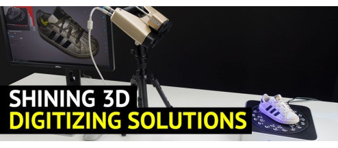
With the appearance of affordable consumer 3D printers, model making has become very popular, and a 3D scanner can greatly add to this hobby making it more creative and versatile. You can scan your favorite model and customize it by changing size, color, or material, or use a 3D scan as a reference for creating more sophisticated versions. You may also want to create a digital 3D catalog of your models, or use them as characters in computer games.
Credit: @slarti_bartfast / Instagram
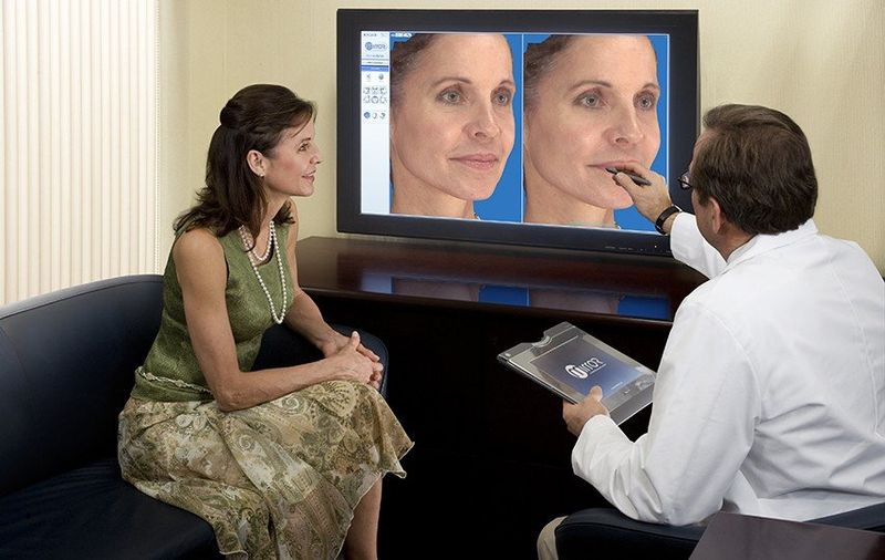
Medical
In the healthcare industry 3D scanning is of great help for prosthetics as it allows creating ergonomic patient-specific prostheses, at the same time reducing production time and cost.
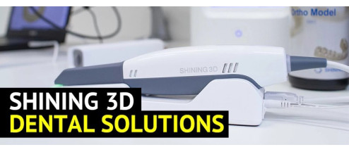
Plastic surgery also greatly benefits from 3D scanning development, as well as dentistry, where dental 3D scanners capable of making fast and accurate digital dental impressions have become a real relief both for patients and doctors.
Credit: ispas.ir
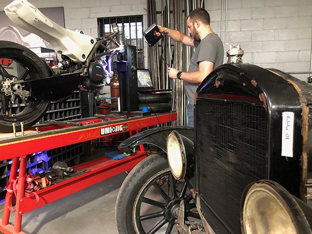
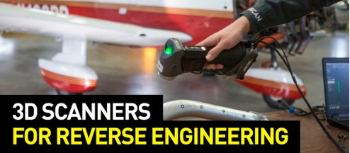
Reverse engineering and repairs
Reverse engineering finds its application in different industries including automotive, aerospace, machinery, and others. The possibility to quickly create a highly accurate 3D model of a part of any complexity absolutely changed the reverse engineering method and streamlined the workflow. The 3D models can be used to customize the existing parts, which is widely applied in the automotive industry, or in repairs to produce spare parts.
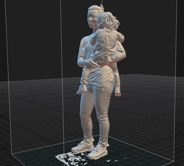
Virtual reality
Designers working with virtual and augmented reality use 3D scanning to capture people and environments to create virtual worlds. Game developers and animation designers employ people scans to make up game and movie characters.
Credit: capturingreality.com
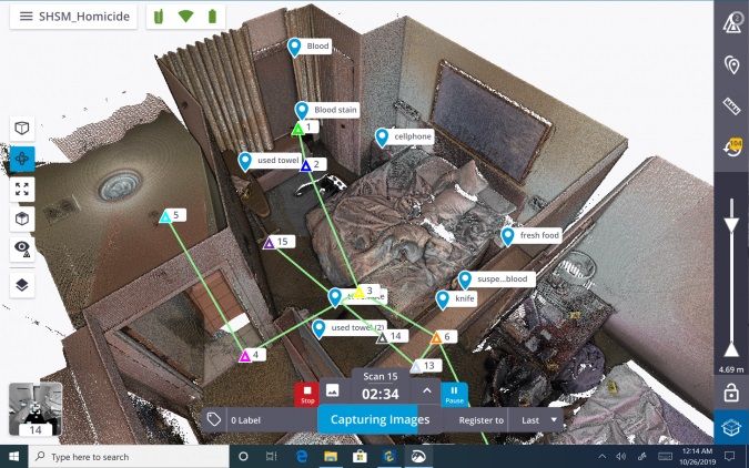
Forensics
3D scanning can help the police in crime investigation as it allows for crime scene reconstruction and physical evidence analysis. Blood stains, shoe prints, and bullet holes can be scanned and then examined carefully. Serious car accident scenes can also be 3D scanned and then analyzed to learn how the accident happened.
Credit: gim-international.com
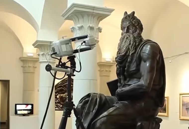
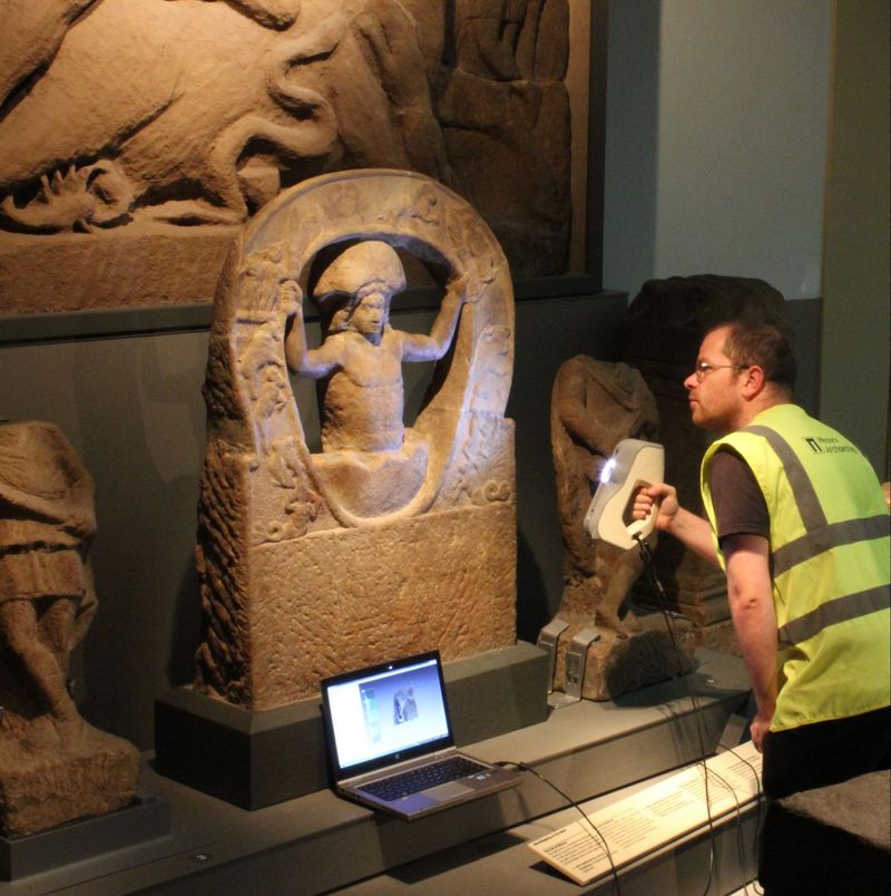
Archeology and archiving
Cultural heritage preservation is the field where 3D scanning technology proves indispensable as it allows for creating accurate three-dimensional digital copies of artifacts for further analysis and archiving.
Credit: wessexarch.co.uk
Architecture
In architecture, 3D scanning technology helps reconstruct historical buildings keeping their original look. It is also useful to 3D scan buildings for survey purposes.
Landscape and interior designers can utilize 3D scanners to create a visualization of a project in a real setting.

Credit: YouTube / ATSABVideos
FAQ


![Einscan Pro 2X 2020 / V2 3D Scanner [1 x Aesub Spray for Free]](https://top3dshop.com/image/cache/catalog/products/3d_scanners/shining_3d/einscan_pro_2x/einscan_pro_2x_4734d382-268x192.jpg)

![Einscan Pro HD 3D Scanner [1 x Aesub Spray for Free]](https://top3dshop.com/image/cache/catalog/products/3d_scanners/shining_3d/einscan_pro_hd/shining_einscan_pro_hd_3d_scanner_3-268x192.jpg)
Write a comment